upskill
A personalized e-learning experience
ROLE
Product Designer
DURATION
3 days
YEAR
2021
This project was developed as part of a recruitment process. I decided to upload this project to my portfolio because I consider it a good showcase of my research, analisys and prototype skills.
context
Today’s educational world is going through changes we’ve never seen before, and the e-learning industry is expected to grow exponentially for many years to come.
With the closure of schools and the cancellation of on-site classes due to the pandemic, students have a new challenge ahead of them. Online education can be an answer. However, it’s not an easy one. The current pandemic has increased the search for self-paced online learning experiences, and within that new context, Upskill has the intention to design a delightful and innovative online learning experience.
My role as a designer was to understand how online learning usually works, their main UX/UI problems, and propose a solution for one of those problems.
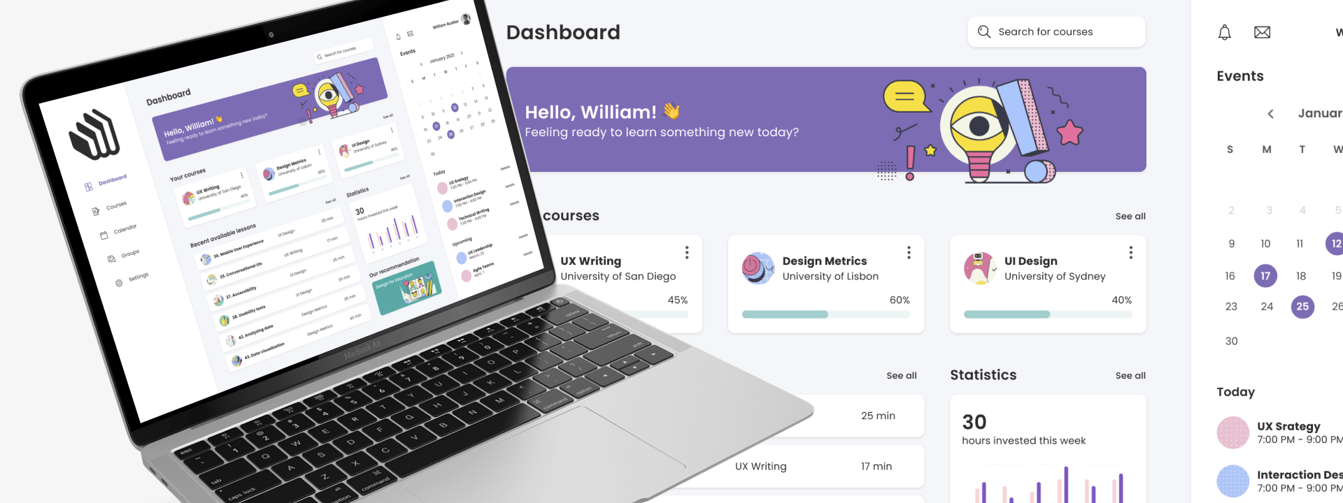
The solution was to create an intuitive, content-focused, and user-friendly web application that would help students to achieve better results when studying online, by adapting its format, with the help of AI, to the one that best suits the student’s needs.
process
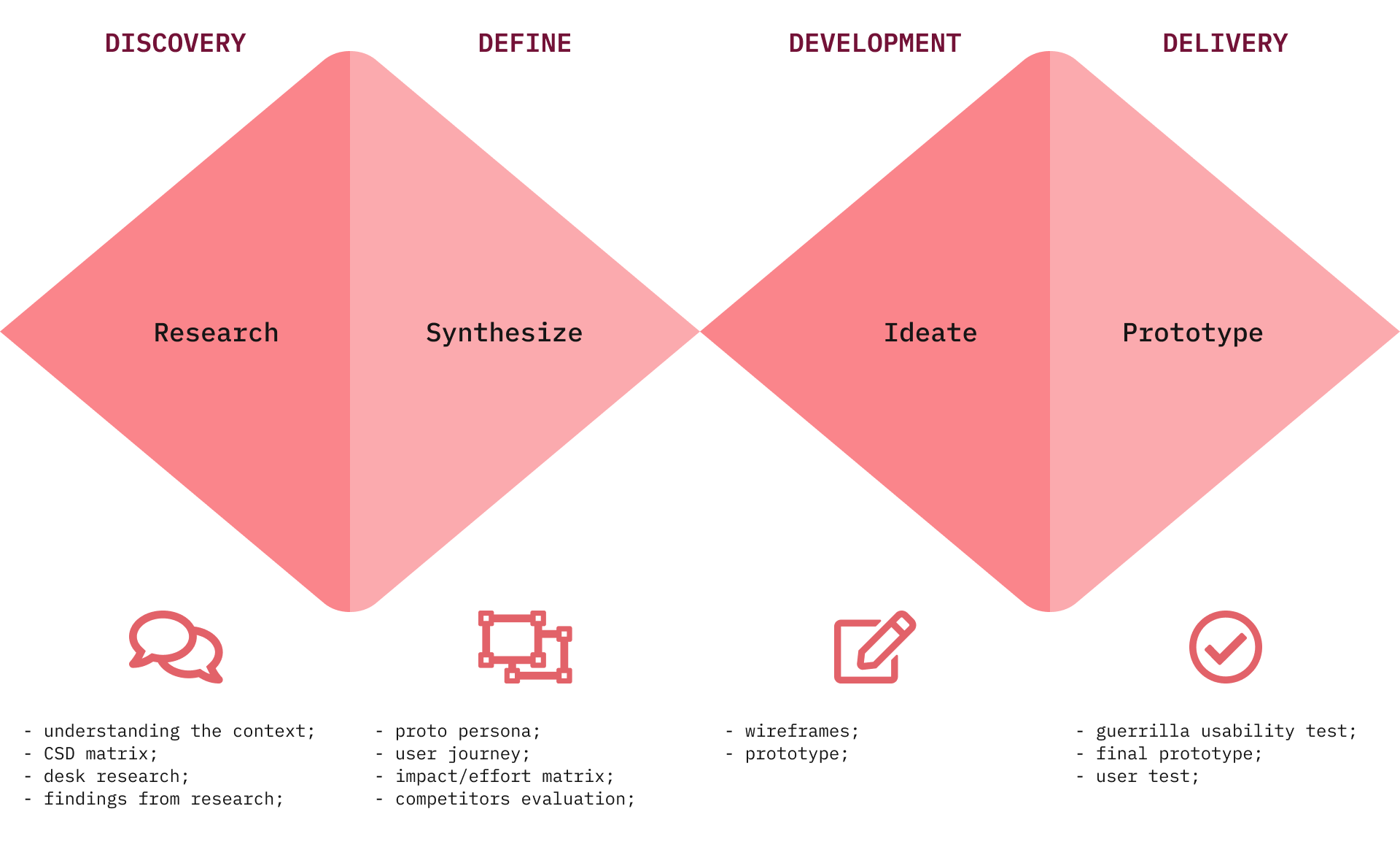
To go from the initial challenge to the solution, I took a series of steps that are part of the design thinking framework, and which helped me to be assertive and create a solution from a human-centered perspective.
DISCOVERY
CSD matrix
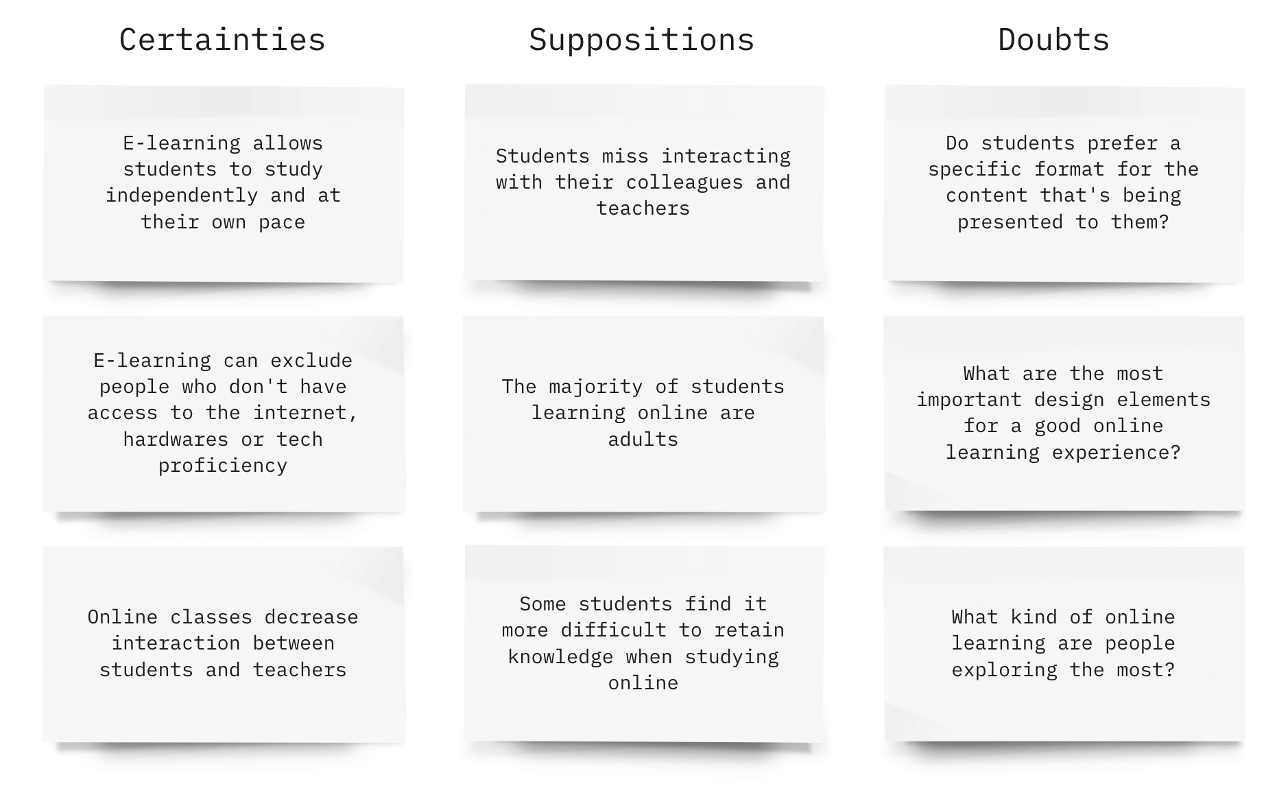
Before starting the research, I decided to build a CSD matrix (Certainties, Suppositions, and Doubts) to help me validate what I should focus my research on and get rid of possible false assumptions early on.
DISCOVERY
Desk research
Because of the time constraint, I decided to go for desk research, since it provides fast insights. It also adds context and depth to primary research findings.
My goal was to understand more about online learning, to identify the usual pain points for users, and also to have information to create my proto persona soon after.
While reading articles and watching videos, I created post-its with key information that I collected. After that, I clustered the information and got into 4 groups: Benefits, Disadvantages, Pain points, and Statistics.

DISCOVERY
Findings from the research
Education is something I have a huge interest in. Especially after I became a father, I always realized how different we are from each other, and that is also reflected in learning experiences. Not all of us learn the same way — yet, we’re usually exposed to the same kind of experience and content.
At the same time, the fastest-growing market in education is the one of MOOCs (massive open online courses). The name says it all: massive. They reach millions of people. But do all of these people learn the same way? No really. So…
How might we help people with different learning capabilities to be able to access a MOOC platform and still have a good experience and satisfactory results?
DEFINE
Proto persona
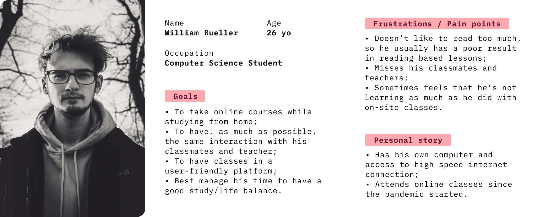
Considering I wouldn’t have the time to run in-depth user interviews, I decided to create a proto persona, based on the desk research and my own previous knowledge about the subject, my assumptions, and insights.
DEFINE
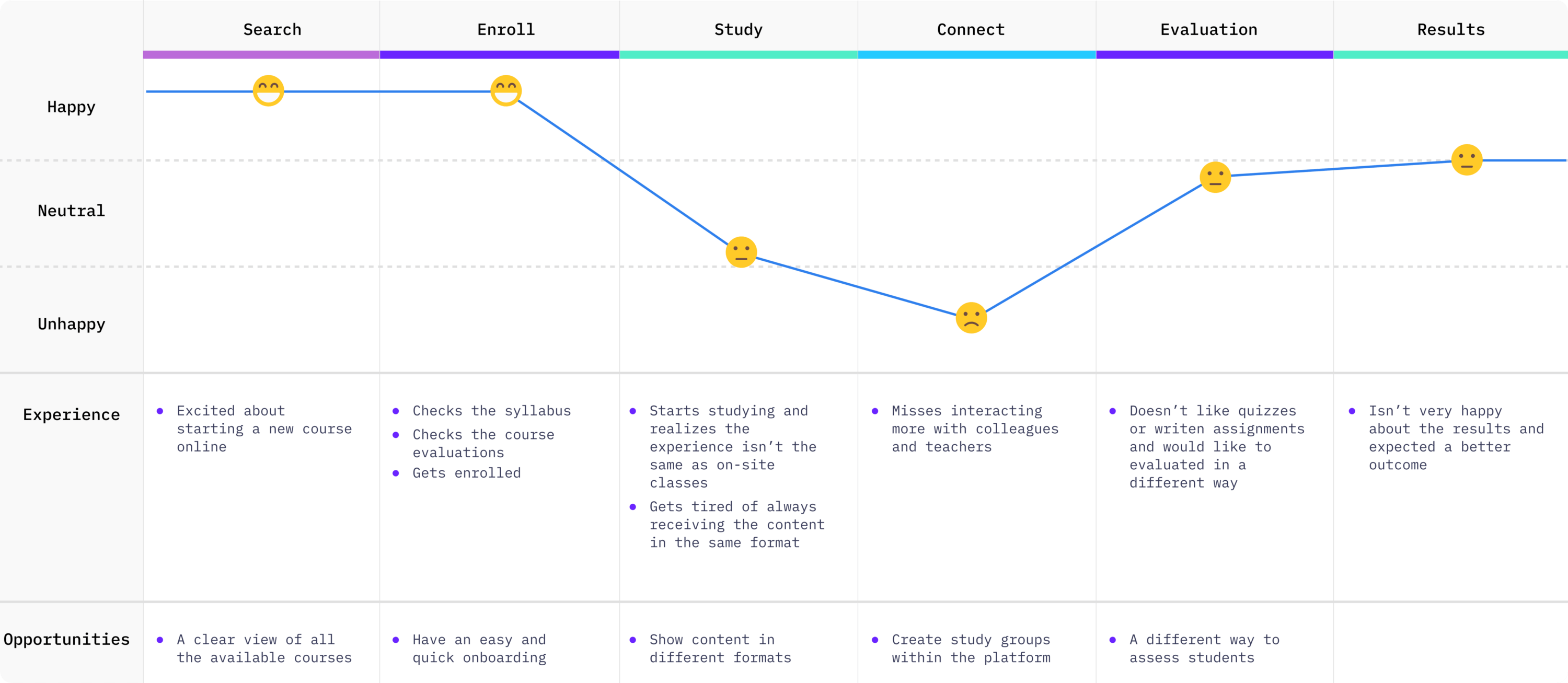
User journey
The user journey helped me to think of what would be the steps the persona would take when searching for an online course and then going through it. By building it, I could also identify possible ideas for my final solution.
DEFINE
Prioritazing the work
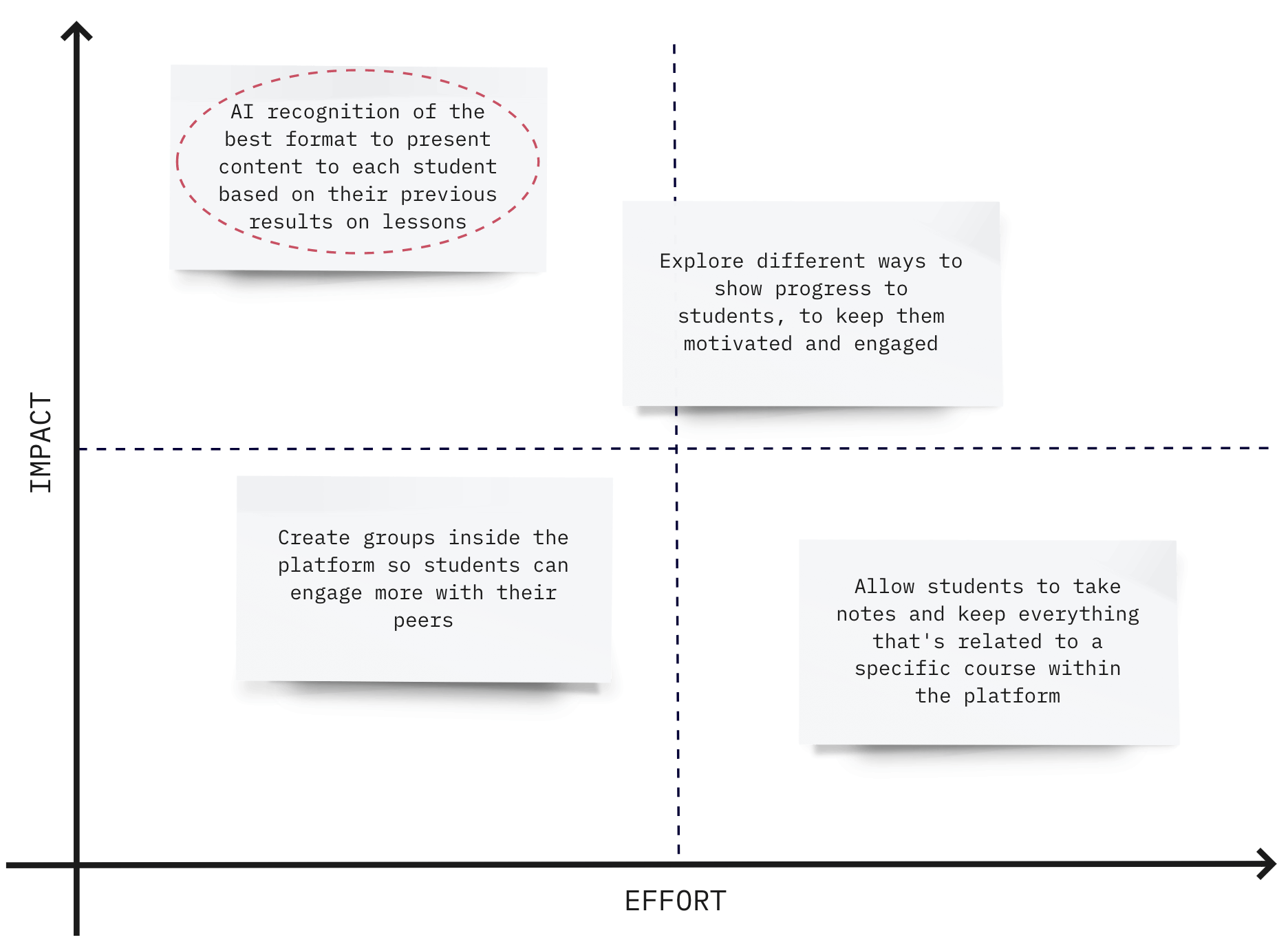
As much as I would like to solve all the problems I identified, I wouldn’t have the time to do so. So I created an Impact/Effort matrix to help me decide on which of the ideas I was going to work on for this challenge.
The Impact relates to the value to the end-user and the Effort relates to my dedication to the design process.
DEFINE
Competitors evaluation
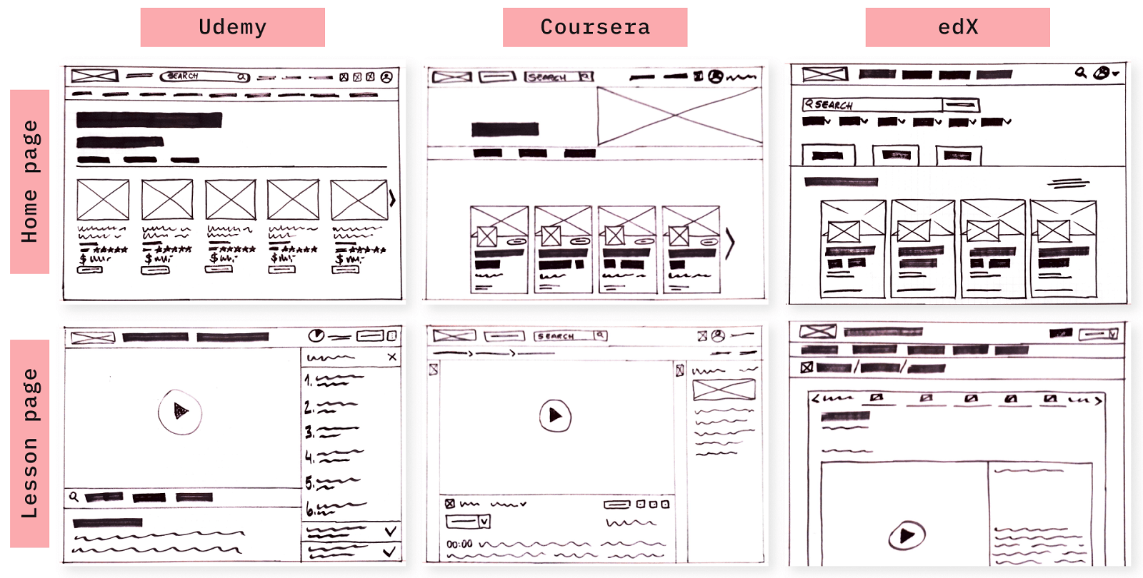
After deciding which idea I was going to tackle, and before jumping into the first sketches, I evaluated the competitors.
I wanted to understand how the biggest MOOCs platforms are structured. What works well, what doesn’t, and what’s mandatory in this kind of product, as well as what features are present in each one of them. To achieve that, I wireframed some screens from three well-known platforms: Udemy, Coursera, and edX.
solution
The concept behind my proposed solution is that we could use AI to identify what is the best way to present the content to students. Based on the results of their assignments, the application could identify that it’s better to present videos, texts, or audios to students. By doing that, I believe users would have a more complete and effective experience since the learning would be adapted to their needs and/or preferences.
PROTOTYPE
Wireframes
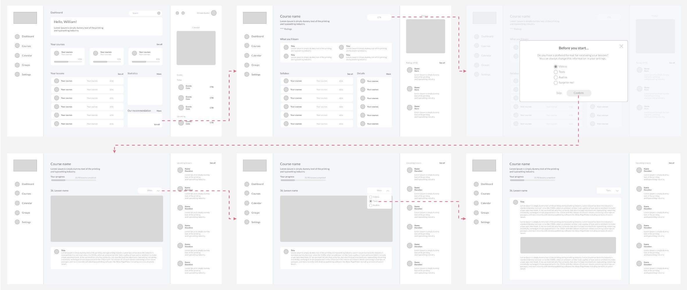
The wireframes helped me to have a vision of the structure and flow of the pages, without having to spend too much time thinking about styling.
Based on the previous research and the competitors' analysis, these were the elements that I considered when building the wireframes:
• A visually attractive UI with a focus on the content rather than any other thing;
• A clear view of the user’s progress to keep them motivated;
• Easy navigation, especially when jumping from one lesson to the other.
In the end, I had a very streamlined and yet effective flow, that matched my initial idea of using AI to help students to decide on the kind of format that they wanted the content to be presented.
The student would be able to choose the format in each lesson, but even if they don’t do it, the application would recognize, based on the results of assessments, which format works better for each student. That would be a way to respect and take into consideration the fact that each person learns differently.
DELIVERY
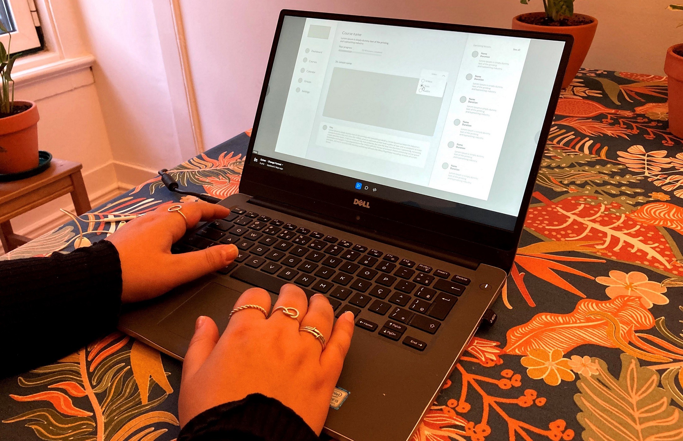
Guerrilla usability test
Ideally, I would recruit real participants to test my wireframes. But because we can’t really do that right now, I tried a different approach. I decided to run a guerrilla usability test, which is a way to evaluate how effective an interface is by testing out its visual design, functionality, and general message.
The feedback I got from the user that tested it was mainly around the visual design, and the proposed flow proved to be effective.
DELIVERY
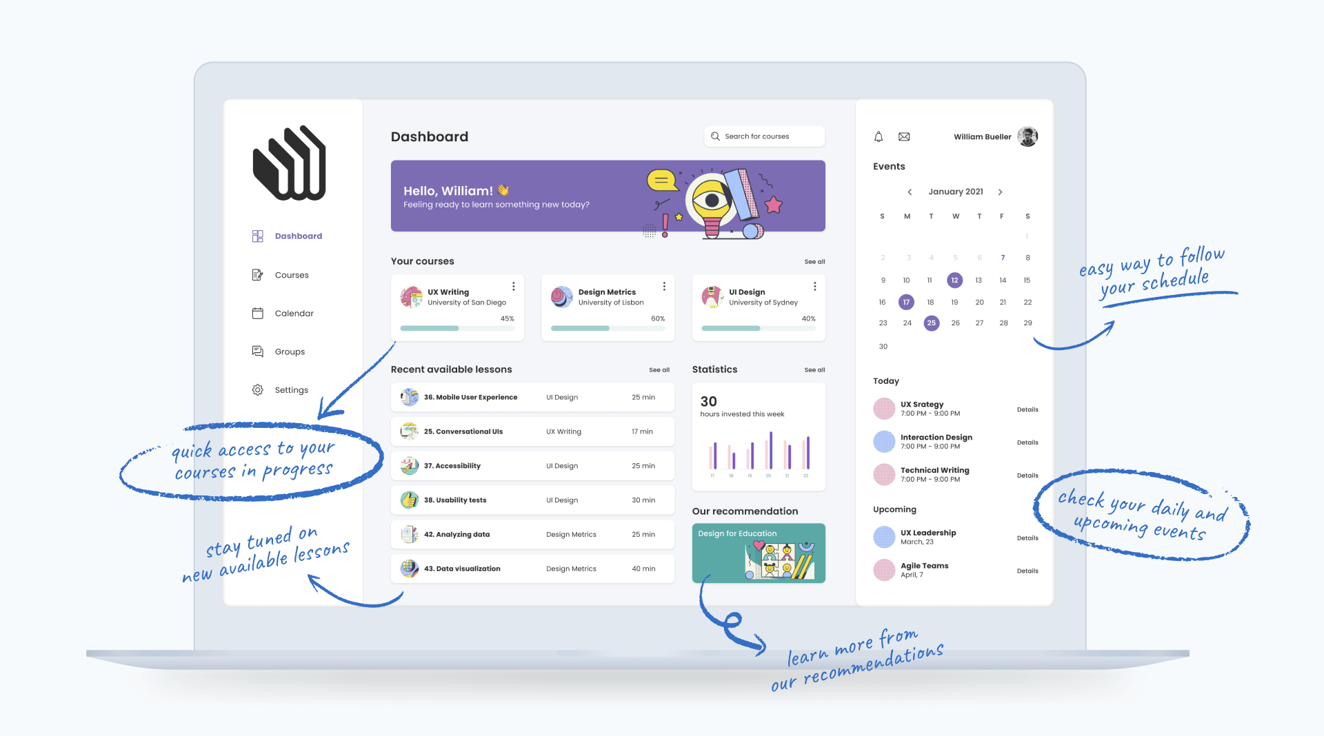
Final prototype
Because time was a constraint for me, I decided to focus on only one screen and delivered the high-fidelity design for the user dashboard.
some final words
I appreciated the opportunity to solve this challenge. Being a huge enthusiast of this subject, it was pretty fun to research and come up with a solution to the problem that was posed.
Design-wise, it helped me to practice my UI skills. I've been studying this topic and applying the atomic approach whenever possible, and it helps me to stay consistent throughout my designs.