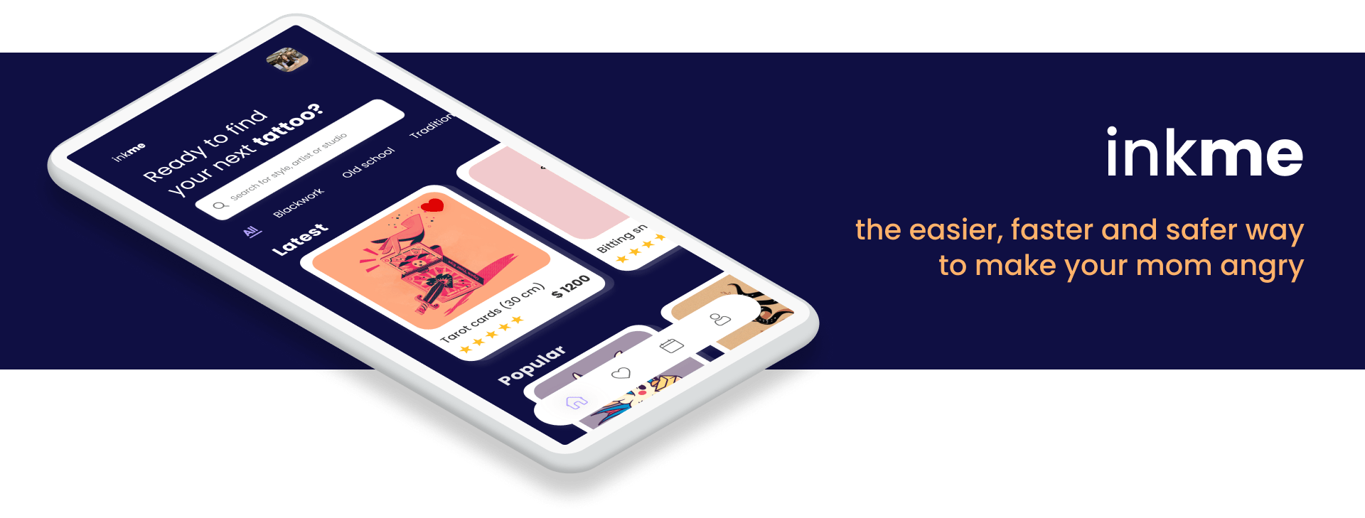
inkme
Connecting tattoo hunters & artists
ROLE
UX/UI Designer
DURATION
2 weeks
YEAR
2020
context
This project was developed in a 2 weeks UX/UI course. By infusing a user-centered design framework into my creative process, I managed to deliver a valuable solution for the problem I identified. Students had to define a problem, go through all the design process and in the end deliver an MVP. I picked the tattoo market, for this is a constantly expanding market and yet there are no consolidated digital products to help both users and tattoo artists to connect to each other.
Main goals:
• Understand users and their goals and needs;
• Understand the tattoo market in Brazil;
• Identify problems that could be solved through design;
• Wireframing and prototyping the solution;
• Validate the proposed solution;
• Have fun and improve my UI skills along the way.
My role: Research, user journey mapping, information architecture, rapid prototyping & visual design.
process

understanding
Having only a few days to develop the whole project, I decided to start with a desk research to better understand the tattoo market in Brazil. At the same time, I created a questionnaire to get responses from people that are interested in getting tattoos to understand who they were and which were their main pain points after deciding to get a new tattoo. I also got to talk in person with 2 tattoo enthusiasts and 1 tattoo artist.
Brazil has around 210 million people, and according to a recent research, 51% of the population has one or more tattoos. The research also shows that there are something around 11.000 active tattoo artists in the country - yet, at the same time, the responses in the questionnaire all mention the same thing: it’s hard to find a tattoo artist that matches their needs. Having all the research data, it was time to create a persona and map their journey, so I could identify improvement opportunities.
Creating the persona
The questionnaire had 47 answers, and the main takeaways were:
• 68% were between 23 and 30 years old;
• 89% had one or more tattoos, and from which:
› 70% had already faced issues when trying to find a tattoo artist;
› 55% had already faced issues when trying to decide on a new tattoo;
› 96% said that the communication with tattoo artists usually takes too long;
• 86% were heavy smartphone users;
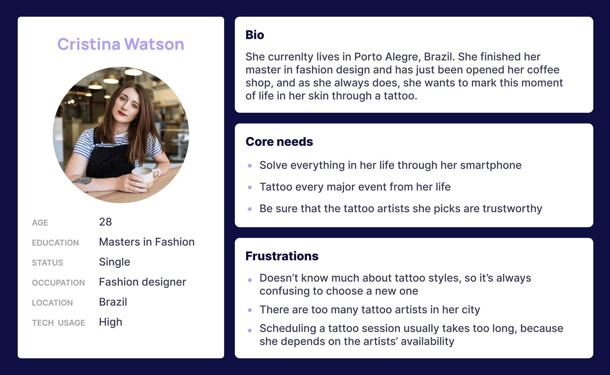
Based on that information, the following persona was created:
Defining the user journey
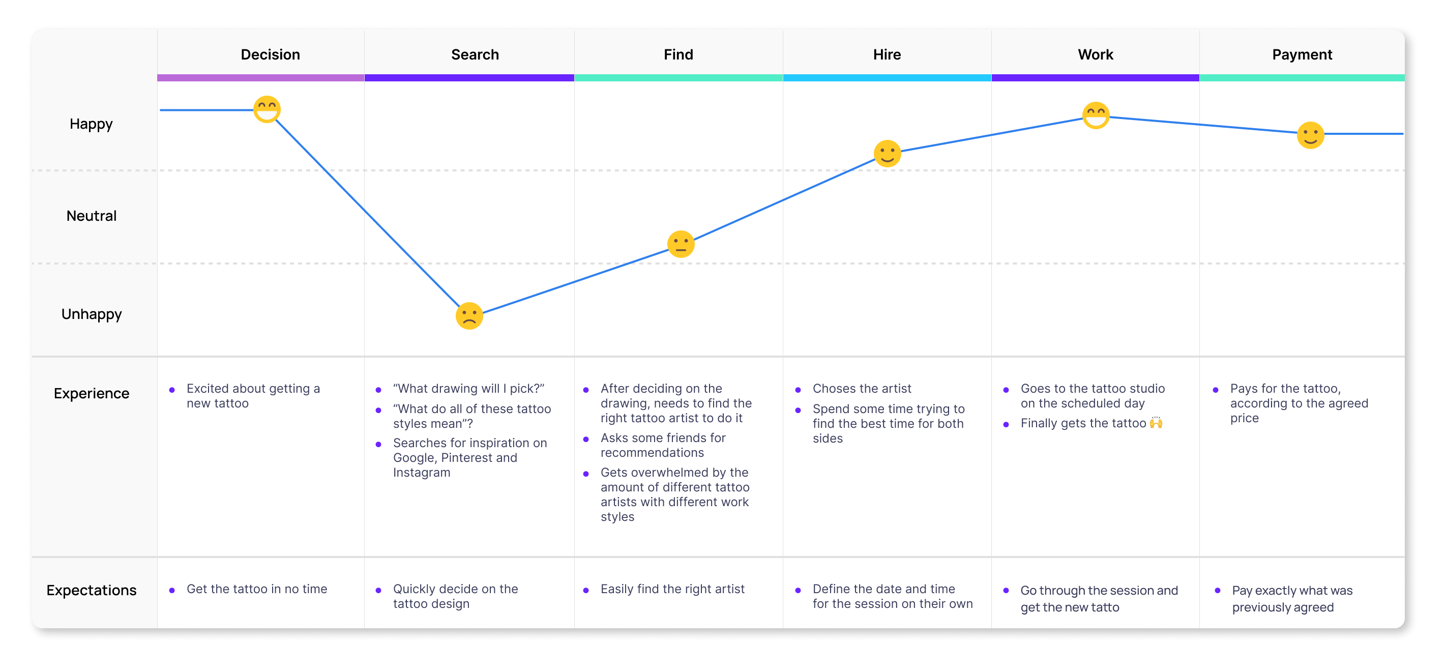
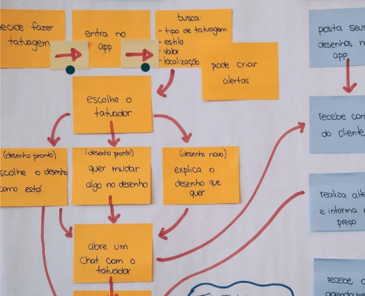
I also decided to map the user’s journey and it helped me to identify the key pain points for users:
1. The overwhelming amount of options both for tattoo designs and tattoo artists;
2. Too much time between deciding to get a tattoo and actually getting it - mostly because of the delay when communicating with the artists or studios;
3. Not having a way to know whether a tattoo artist or studio is reliable or not, and having to trust on friend’s opinions only.
In the end, what was supposed to be an amazing experience was in fact something with a lot of ups and downs for the clients.
Framing the problem
"How might we make the process of getting a new tattoo to be faster, easier and trustworthy?"
ideation
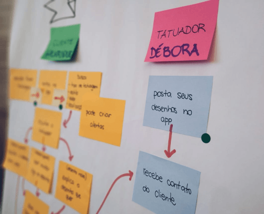
Part of the course was to run an ideation session with the colleagues, so we didn’t go through the course and the project relying only on our own assumptions. I decided to run a brainwriting session, and everyone had to write down three ideas that related to the problem during five minutes. After that, everyone had to pass their ideas to the person on their right, who would then build off of the ideas. After another few minutes, everyone would pass the piece of paper again until it made it all the way around the table. Once the ideas made it around the circle, we discussed them and decided which one was best to pursue.
solution
Create a user-friendly app that offers guidance to help tattoo hunters find the perfect tattoo while comfortably exploring a range of possibilities. Users would have a profile and then they could search for tattoo styles, tattoo artists or studios.
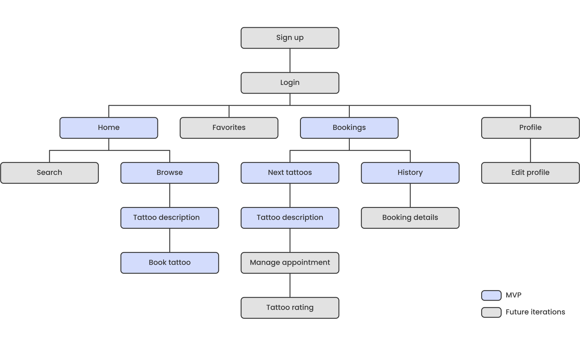
The app would allow users to book tattoo sessions, without having to talk to the artists - which would make the gap between deciding to get a tattoo and actually getting it to be smaller. In addition, there would be an evaluation system so that, collaboratively, a network of good professionals could be created. I was aware that the features for the tattoo artist would have to be a part of the MVP, otherwise the app wouldn’t have any data to be displayed, but because time was a constraint, I decided to focus only on the client flow.
validation
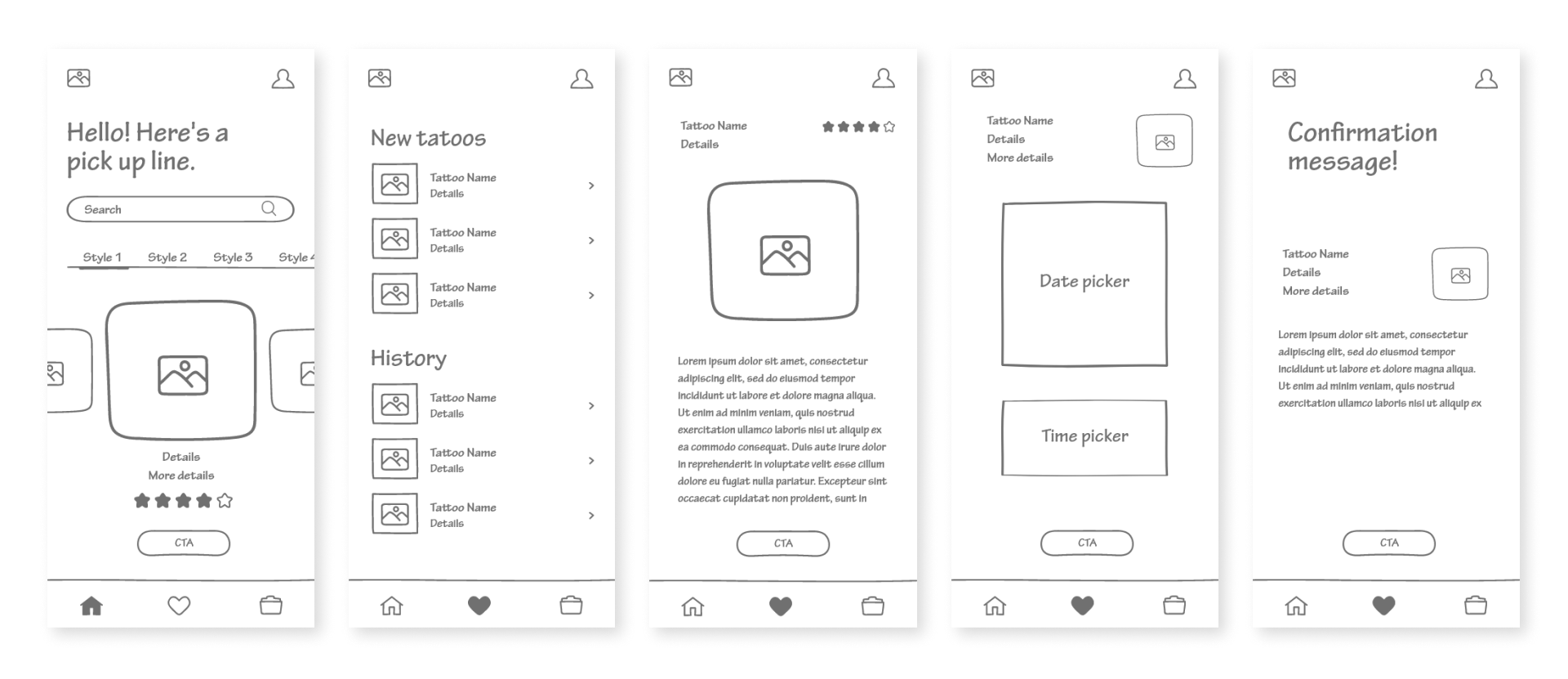
After testing the wireframes with some of my colleagues and also the two interviewees, some changes were made to make the experience mre smoother. The feedbacks also gave me plenty of ideas of features to include in the app, but I couldn’t design all of them, so I had to prioritize, and then got to the final designs.
HOME
the hardest part
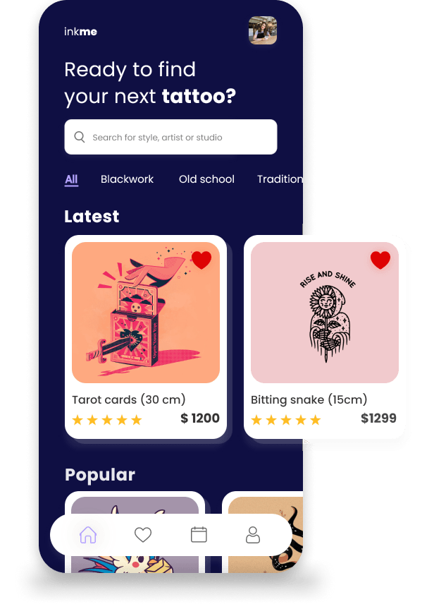
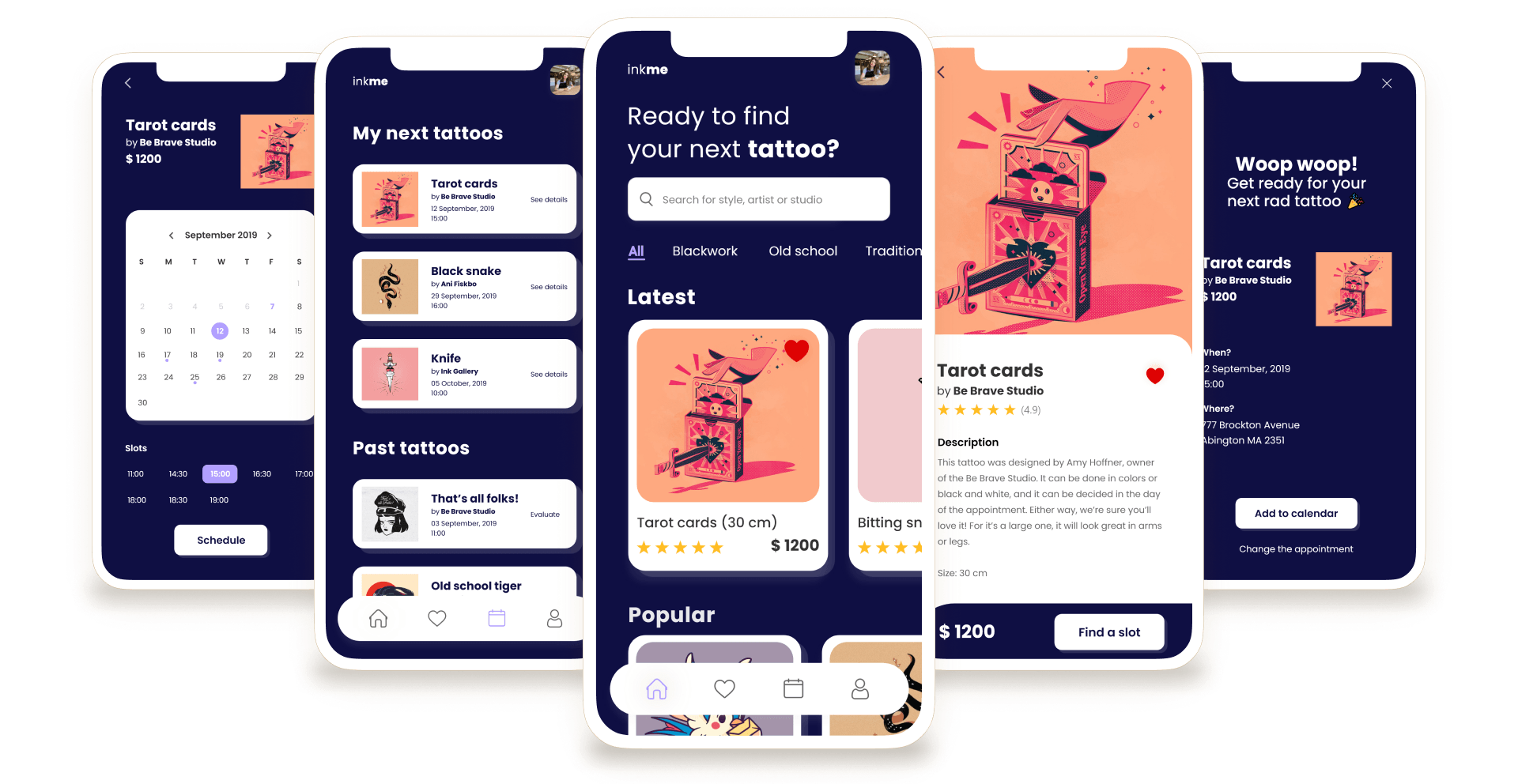
Search your favorite subject or easily browse the categories to find a perfect tattoo.
TATTOO PAGE
the masterpiece
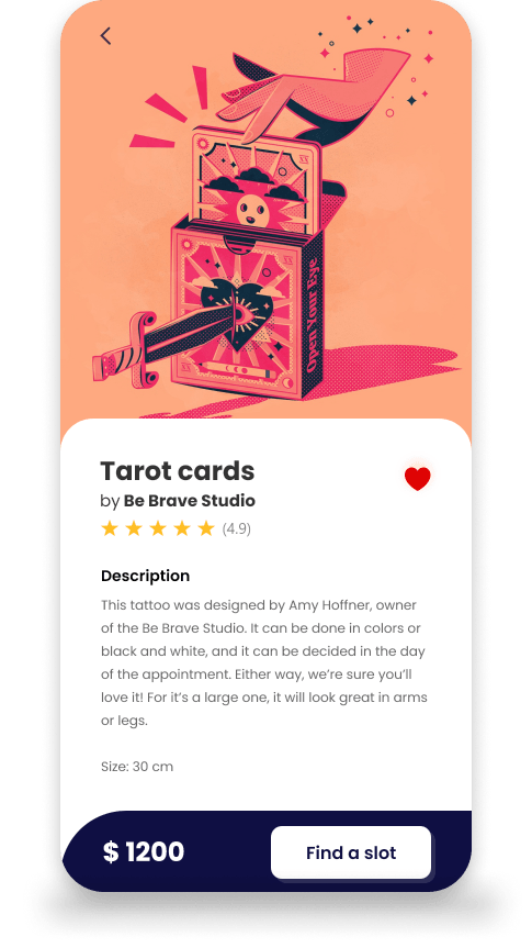
Check all information and details about your chosen tattoo.
Set the drawing as your favorites for future choices.
Find the best slot to get it on your skin. Forever.
BOOK TATTOO
it's a date
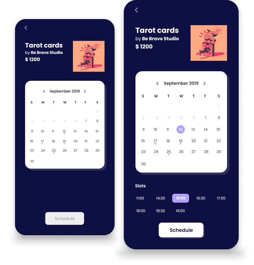
Select the date and time according to artist's availability.
MANAGE APPOINTMENT
let's get some ink
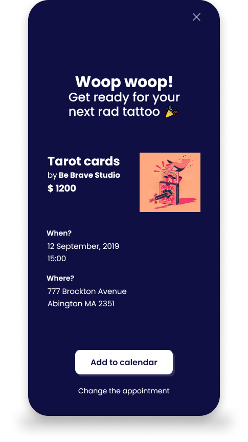
All you need to know before you get tattooed.
Review details and manage your appointment easily on your phone.
BOOKINGS
stay tuned
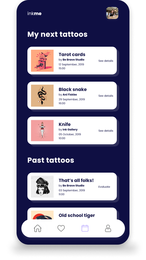
Keep track of your future and past appointments.
Rate the masterpiece and make the artist famous.
learnings & insights
I wish I had the chance to develop this project with other designers. The way the course was structured, all the projects were developed individually, but I think we could get more out of it by working collaboratively. The ideation session that happened with other colleagues was really helpful and helped me to realize how biased I was by thinking of only one possible solution for the problem. So I'm sure the result could benefit from more people working on the solution.
I also should have managed my time better, so I could design for the tattoo artists too.
Other than that, it was nice to explore a more bold visual design for the application, and I enjoyed the process very much.