Juntos
Building better things together
ROLE
Researcher & Designer
DURATION
2 months
YEAR
2016
context
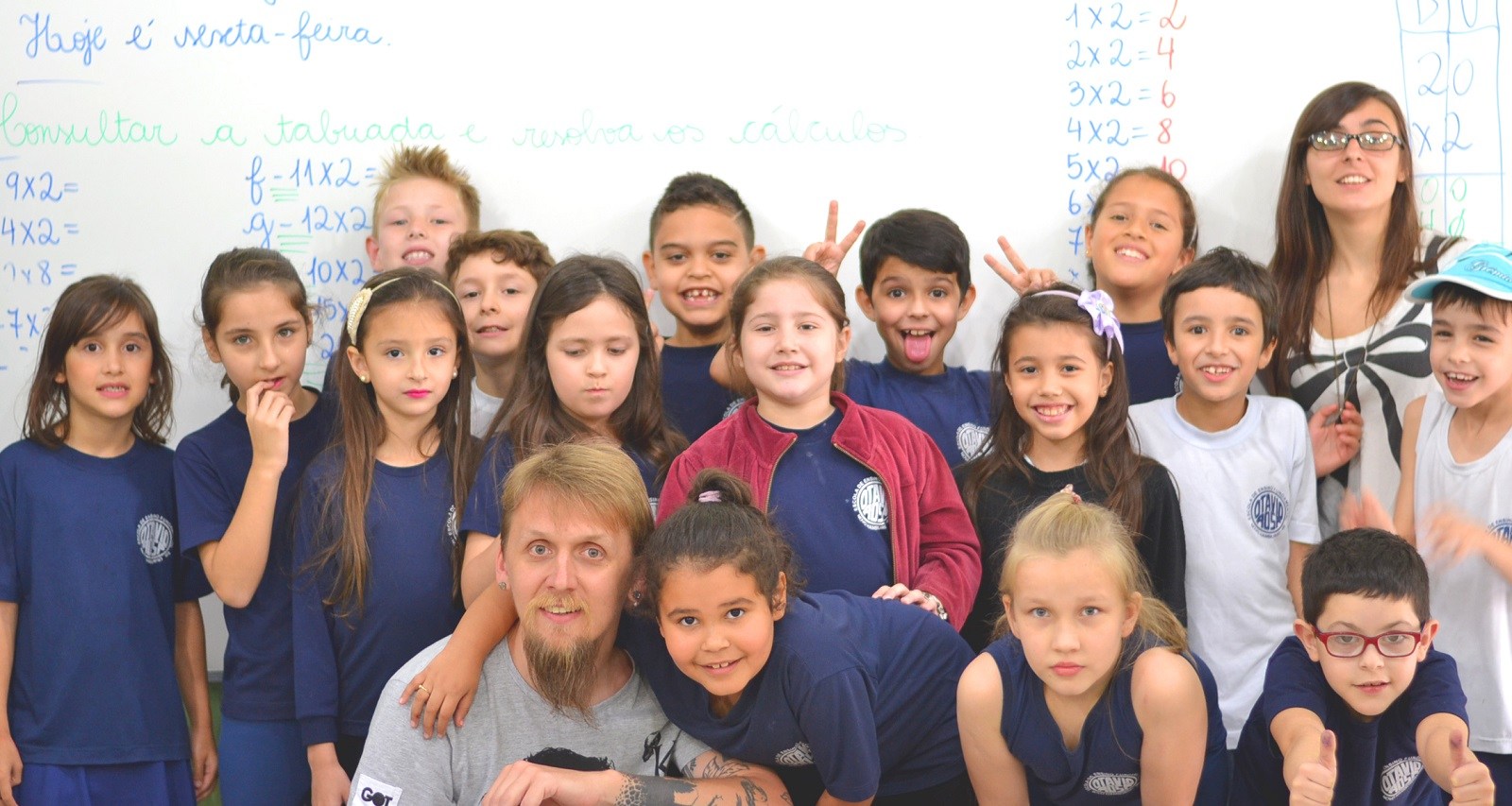
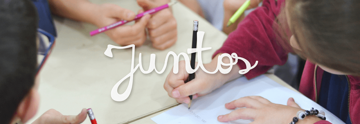
Juntos was a project developed with 7-year-old students from a school in Novo Hamburgo/Brazil. As a team of three, we co-designed a typeface to show kids that despite their differences as a group, they could create something bigger together. By overlapping the writing of each one of the students, we created a single font, called ‘Juntos’, which means ‘together’ in Portuguese. We also encouraged the students to reflect on the group work and on their group identity by using design as a tool of change, both in school and in their own social context.
My role: Research, workshop facilitation, graphic & type design.
Award winning project

In 2016, we received the most important award for design students in the world:
the iF Student Design Award.
See iF Design Award page
the beginning
Juntos was an amazing project to create. I always had a high interest in the way design can improve people's lives, even before I started to work in tech. Besides that, I also have a personal belief that children are the ones we should be listening to and working to since they are obviously our future.
This started in university, in a specific class where the teacher told us to develop a project having only one premise: impact someone's life.
I then gathered with two other colleagues that shared the same interests as I do and that was the beginning of this journey.
From the beginning, we knew we wanted to work with kids, but we didn't know exactly what was the problem we were going to solve. We contacted a school from the city, presenting ourselves as design students, and hoped that they would let us have contact with the children.
And they did! They gave us three days with the kids, which was fantastic.
Day one
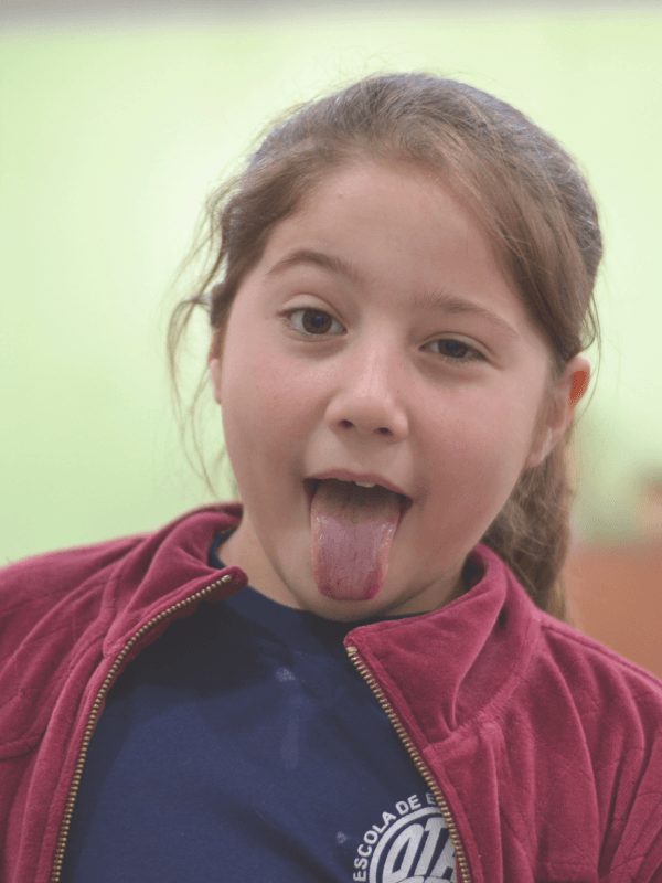
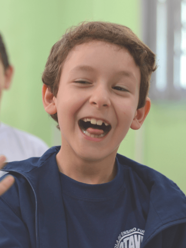
On the first day, apart from introducing ourselves to the kids and learning who each one of them was, we also had to explain in a very easy way what design was. It was a delightful exercise because most of our time as students and professional designers is spent arguing with other designers about what design is.
We made the easiest analogies, relating design to objects and trying not to abstract too much. It worked, and they were amazed by how many things have a designer's work in it.
Apart from presenting to them, we also observed. A lot. We sat for long periods of time watching them interacting with each other, having classes, and also their individual behaviors.
Another important part of this research was their teacher. She helped us with many insights about the kids and their behavior as a group, and together with our observations, it helped us to define our problem by the end of the first day.
Day two
So we had identified our problem: the clusterization inside the group was stopping everyone from having the best they could from the classes. Boys separated from girls. Boys who didn't like soccer separated from boys who did like soccer. And so on. That would eventually create fights between them and make it very hard for a new kid to integrate in their first days.
Having our problem, we used the space between day one and day two to ideate. Our problem was:
"How can we show these kids the importance of working together without leaving behind what's unique about each one of them?"
With that in mind, the first part of day two was dedicated to brainstorming and more observation. By noon, we had our answer.
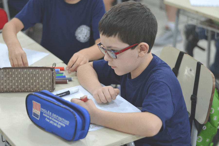
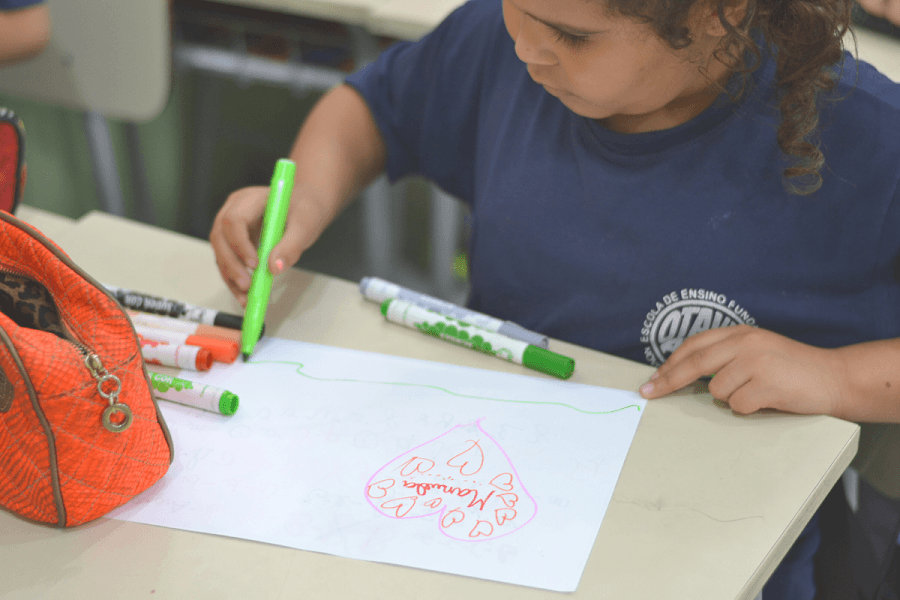
We realized that all of them were going through the same period in their lives: alphabetization. All of them learning a new way to communicate together. We decided to use their handwriting - something that is very unique, yet common to everyone.
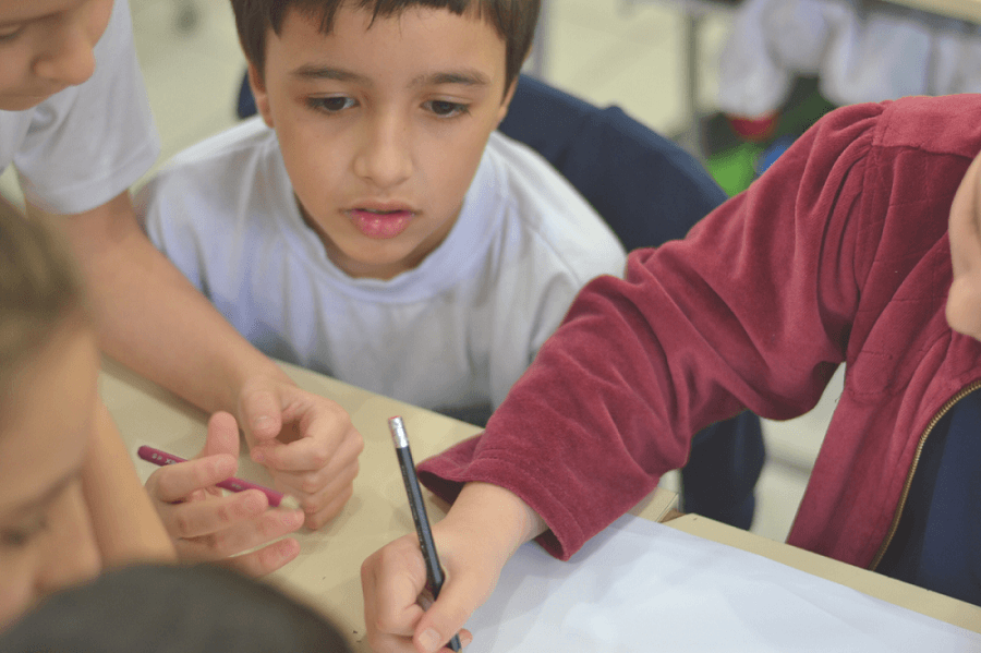
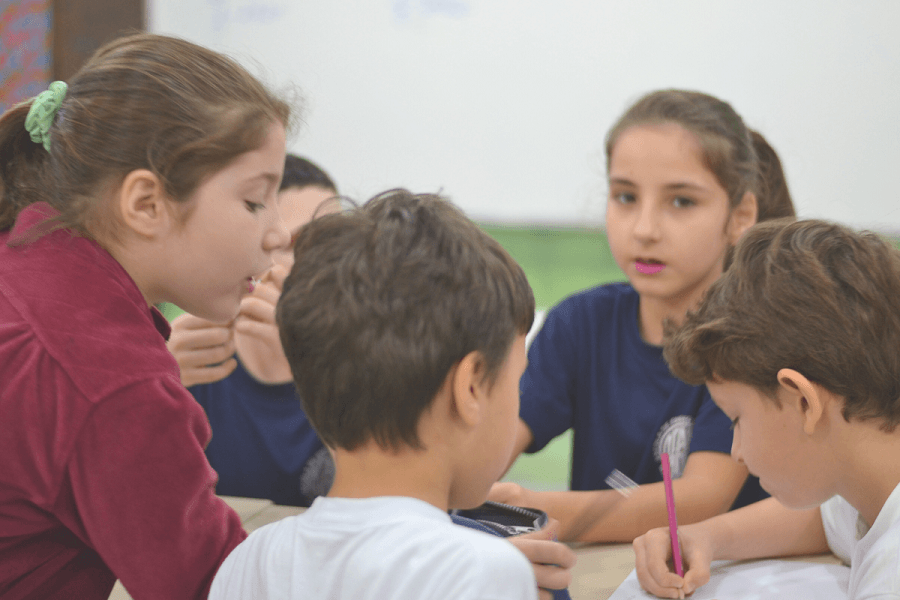
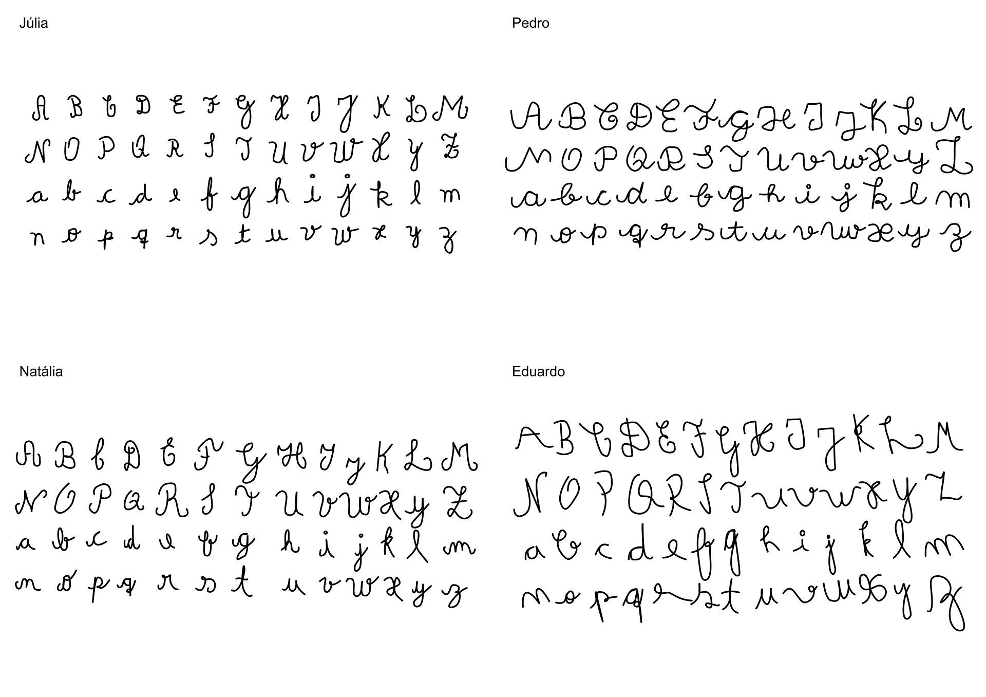
By then, we asked them to write in their own way the whole alphabet, which was so cute. They all followed a given model the teacher provided, but each letter had the personality of the children writing it.
Day three
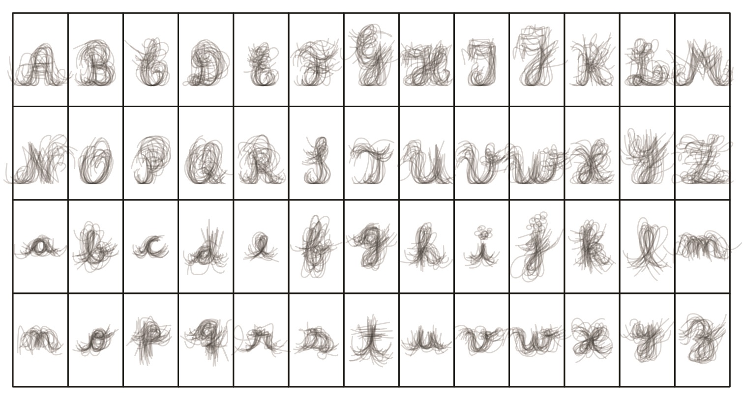
After we collected all their handwritings, we went on to more technical work. We overlayed all of the letters, obtaining a middle line, which with some adjustments, finally gave us their group writing.
17
students
2
months
26
letters
1
identity
the process
STEP 1:
Digitalization of all their handwriting
STEP 2:
Overlay of all the individual handwritings
STEP 3:
Extraction of the middle line
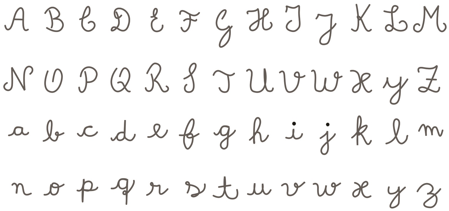
STEP 4:
Adjustments to get to the final typeface
result
It was a very exciting moment for us as designers!
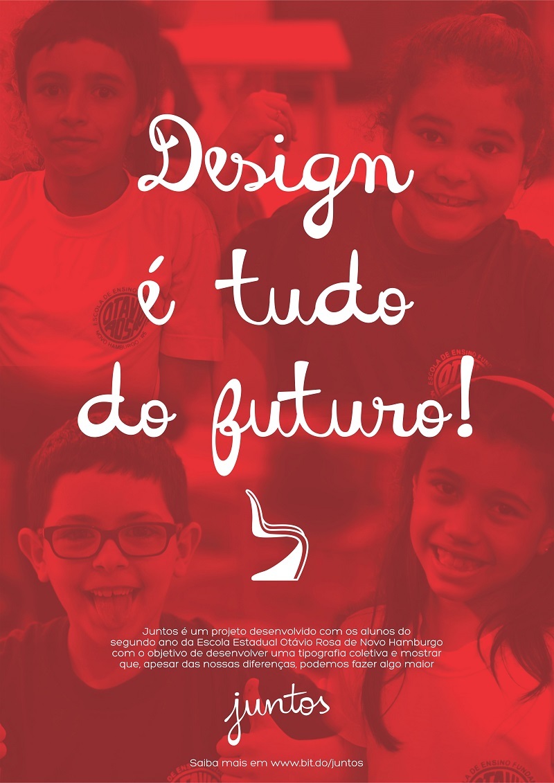
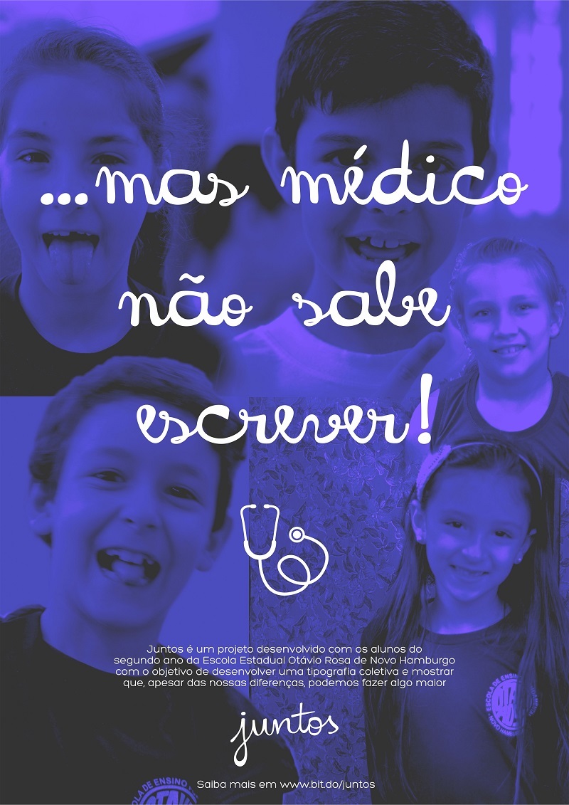
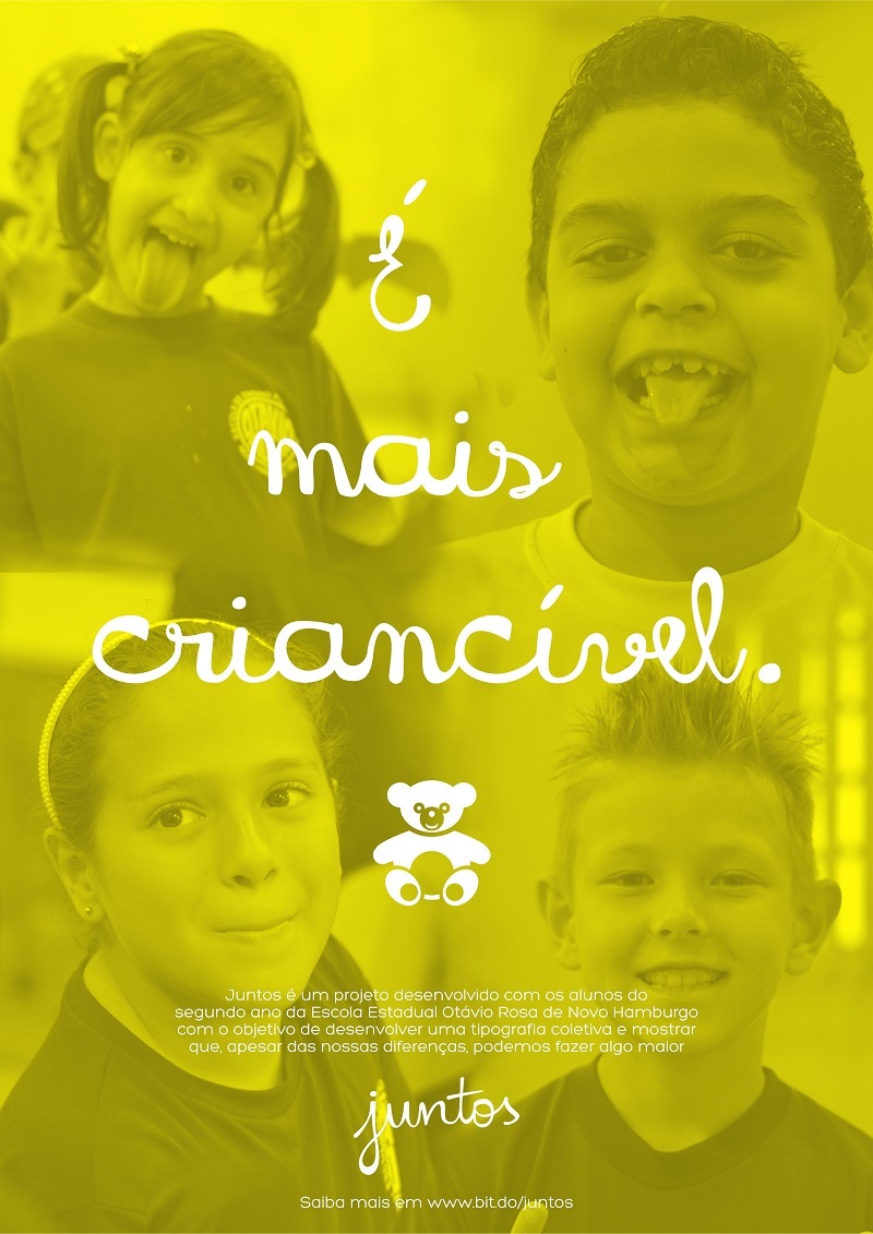
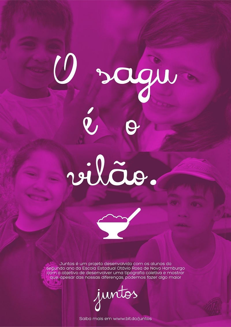
We designed the typeface, created some posters with sentences we heard from them during the three days, and printed them to post them all over their school. They were just as proud as we were!
On the last day, after we presented the result for them, we got their feedback. It's important to mention that we never told the kids what our main objective was — helping them to understand and value themselves as a group, because we wanted to learn if we could help them to realize that by using Design. When we asked them for their impressions about the project, the things they told us were amazing:
• They found the font beautiful;
• They had a very fun time with us;
• Several of them told us they'd like to study Design as adults;
• They realized that although they were different, they could achieve wonderful results when working together;
• & that they were grateful to have been able to help and be part of our project.
We believe that we have successfully achieved our goal, which was to impact lives. Not only theirs but ours as well.
recap
Some months after finishing the project, we were awarded the iF Student Design Award. That was undoubtedly an honor, but being able to work with children and knowing that they absorbed this understanding of what a group and a community are, as well as their importance, was far beyond great. It was an amazing experience for us!
