astra airlines
Last call for easy flying
ROLE
Product Designer
DURATION
3 days
YEAR
2019
This project was developed as part of an event at SAP in 2019. The goal of this event was to put into practice all the learnings from a 4-weeks training in UX design methodologies. Because it was a solo project, I was responsible for the whole process, from research to UI designs.
context
Astra Airlines, a budget airline, wanted to design their new app to provide a better experience for their users.
Main goals:
• Understanding user roles and goals;
• Deriving the business process of an application;
• Wireframing and prototyping;
• Story identification and slicing;
• Story writing and elaboration;
The solution showcased here is an MVP for a simple and intuitive app, which will help Astra's customers to search for their tickets and have all the services they need in their hands, offering a mobile-friendly customer-centric experience concentrating on the path to sale completion. Because I had two roles in this project, besides the design deliverables, I also worked on writing user stories, which was a great exercise and helped me to understand better the business goals and how my designs could help.
My role: Synthesis, Business Analysis, Information Architecture, Wireframing & Prototyping.
process

DISCOVERY
Synthesis & Personas
I was given a spreadsheet coming from the Sales & Marketing department with information about customers. The first part is about booking information: the number of purchased tickets, type of travel (business or leisure), fare booked (flexible, standard or lower). The second part contains responses from a survey placed to these same users, with information about the reason why Astra was chosen, the chosen add-ons and personal information.

Having all this information in hands, I took a series of steps:
1. Identified a list of candidate roles of the Astra system;
2. Based on their feedback, I prioritized which candidate roles were most relevant to Astra, always having in mind the business objectives;
3. Defined a set of behaviors, goals, and frustrations for each role;
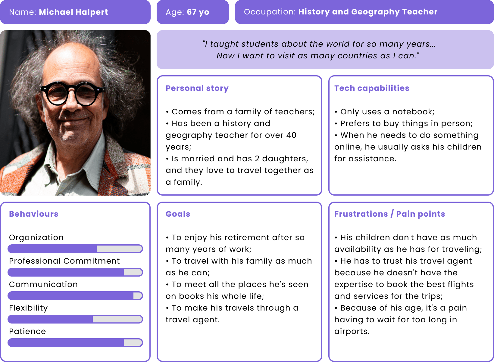
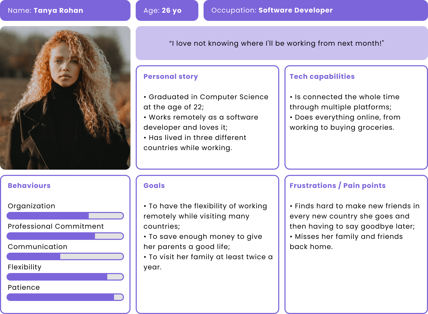
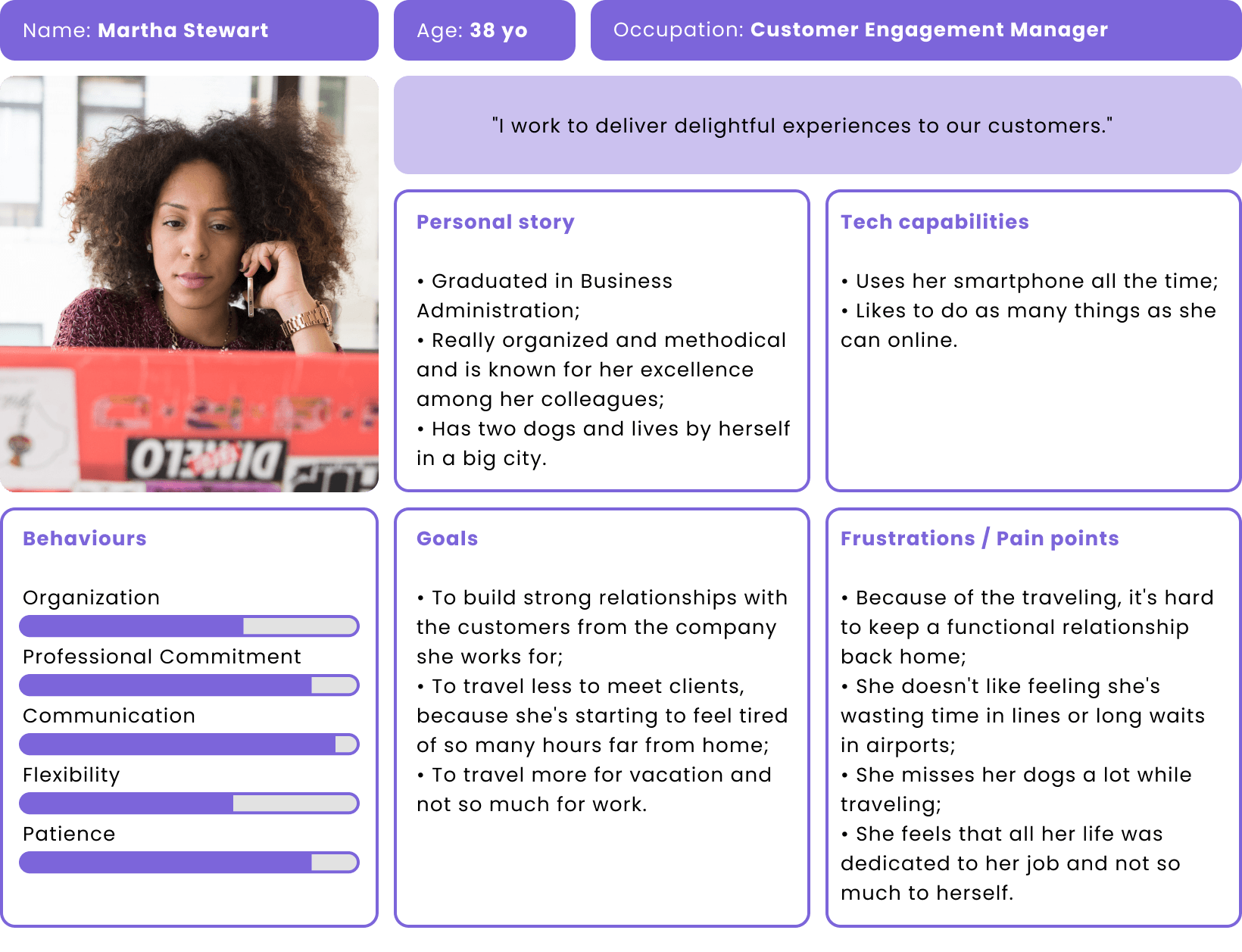
4. From this understanding of each role, I then created three detailed personas.
THE RETIRED TEACHER
THE REMOTE DEVELOPER
THE BUSINESS WOMAN
DISCOVERY
User Journey
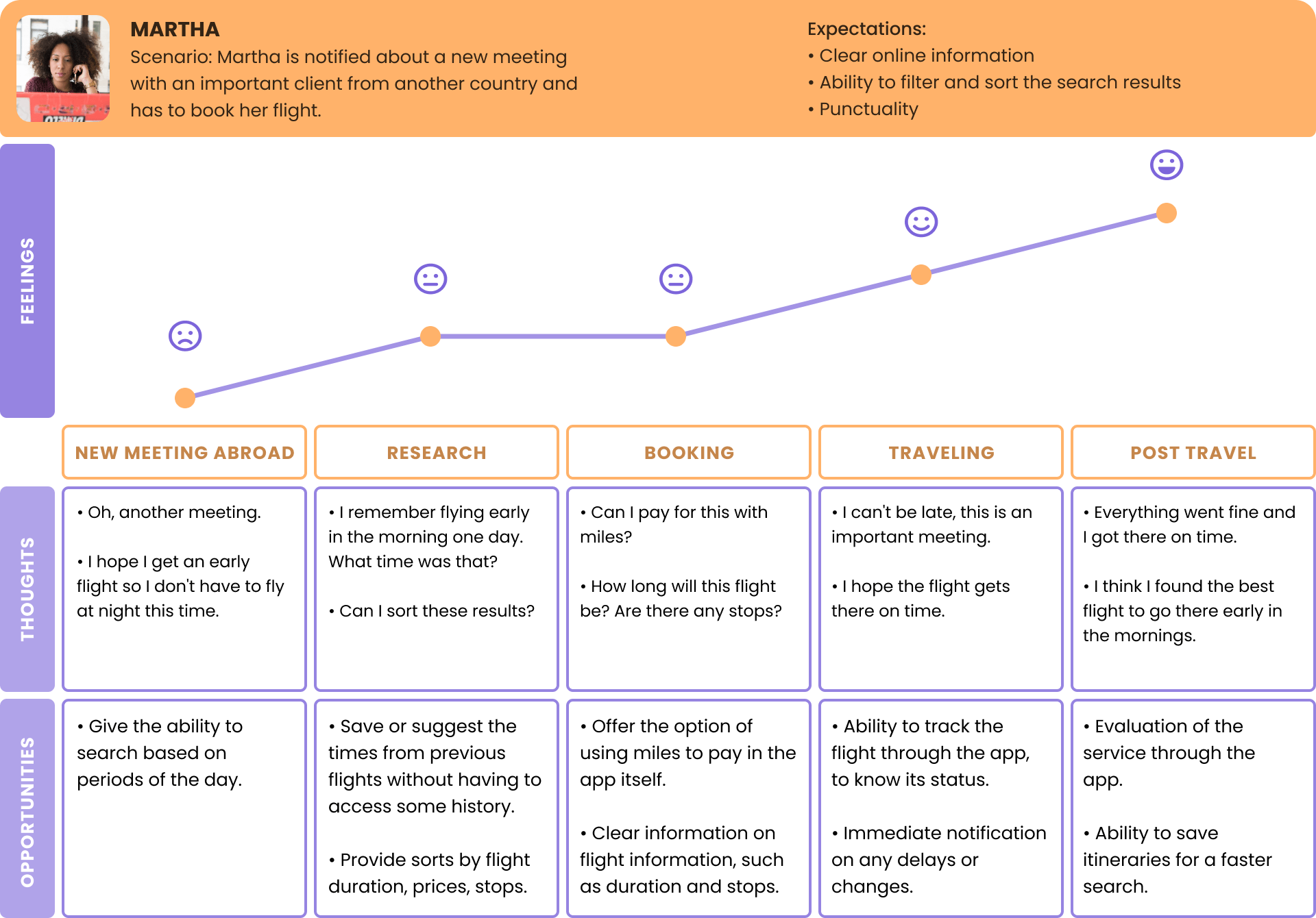
Having the personas, it was time to create a User Journey. Because the time was short, only one persona was chosen to create the journey. It helps to understand and address user needs and pain points, and also to understand user behavior, uncover gaps in the user experience, and then take action to optimize the experience.
DEFINE
Story Mapping & User Stories
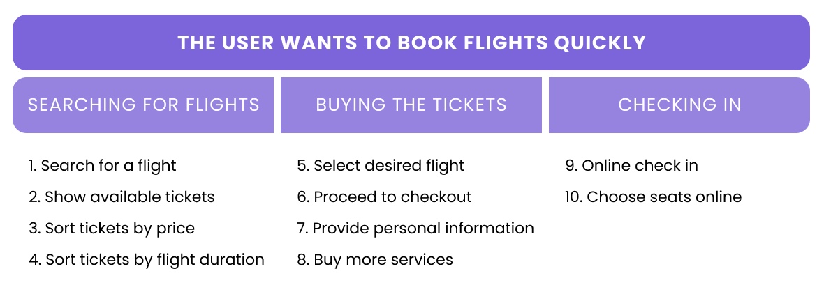
In this step, I first created a story mapping that covered the concept I created, consisting of epics and a backlog of user stories. Writing the stories also helped me to ideate and sketch later.
Main goals:
• Create stories that are end-to-end;
• Create stories that satisfy the INVEST principle;
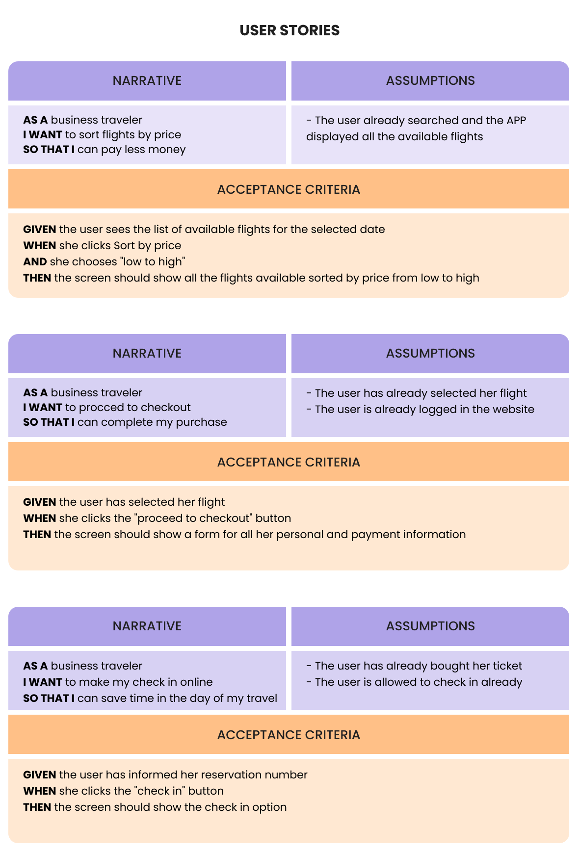
• Write clear narratives from the viewpoint of the end-user and the business;
• Write acceptance criteria that can be clearly understood by anyone reading it.
After having the user stories written, we decided to tackle the ones related to the path to sale completion. I didn’t need to write all the stories because those would be too many, but the ones I wrote already helped me to define better the next steps.
IDEATION
Lo-fi sketches
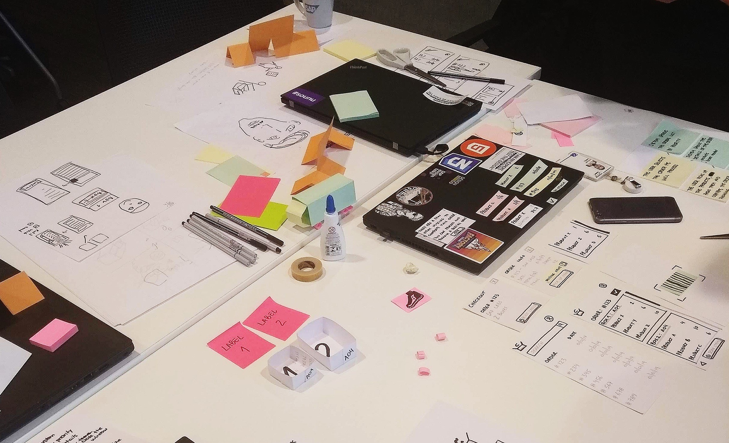
I prototyped using paper, and then tested the flow with my team and also participants from other teams. It was really hands on!
VALIDATION
System Usability Scale
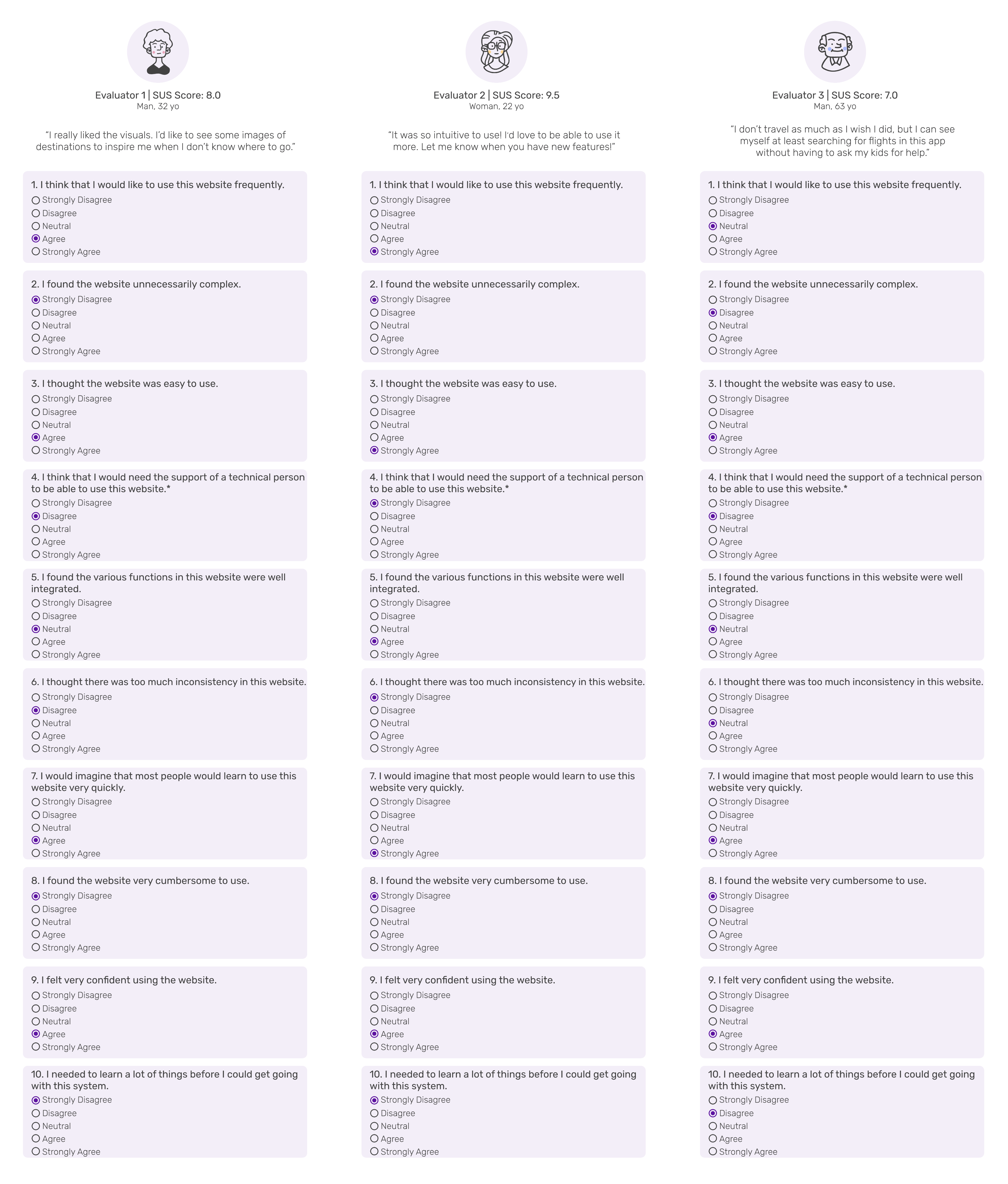
After I tested the paper prototype, I designed some wireframes and then got them tested by 3 different users, so I could apply the System Usability Scale.
The System Usability Scale (SUS) is a questionnaire to measure usability. It can be used to measure any systems and applications ranging from digital products such as mobile apps, digital kiosks, laptops to machinery. The main benefits of using this method are:
• It is quick. The template is readily available. There’s no need to rephrase or think of your own questionnaire;
• It is cheap. This questionnaire can be administered easily without much effort;
• It is tested and reliable.
Although this 10-item scale looks simple, it has been validated with thousands of surveys over hundreds of studies for decades.
VALIDATION
Applying the questionnaire
I tested the interface with three users of different ages. I asked them to simulate the designed flow (Search for tickets > Choose tickets > Provide information > Payment) and then applied SUS.
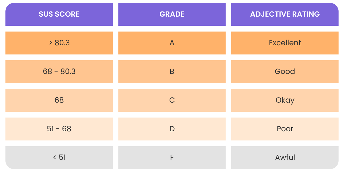
The average SUS score is 68. This means that a score of 68 is the same as 50%. Below is the general guideline on the interpretation of the SUS score and the three questionnaire details:
PROTOTYPE
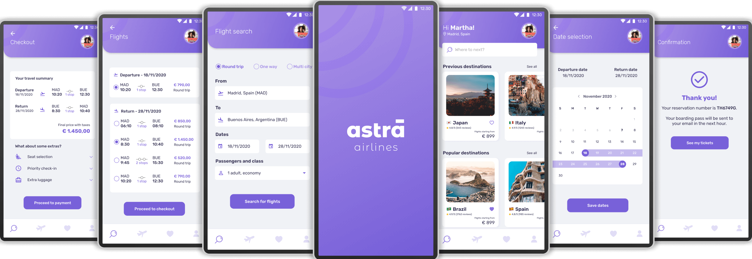
Hi-fi mockups
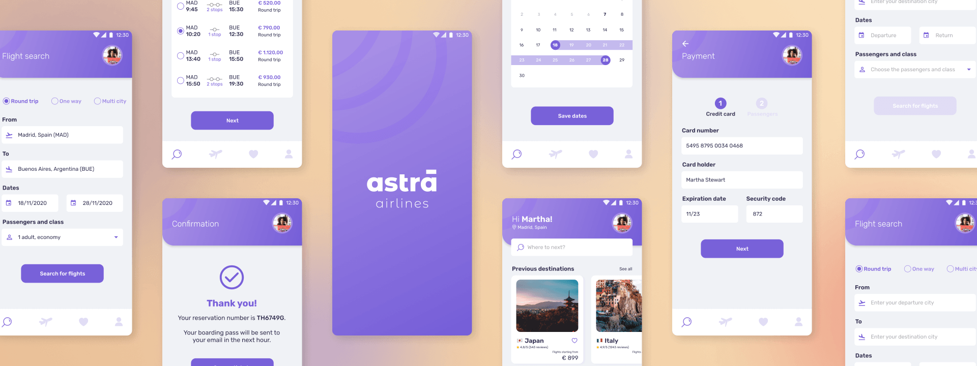
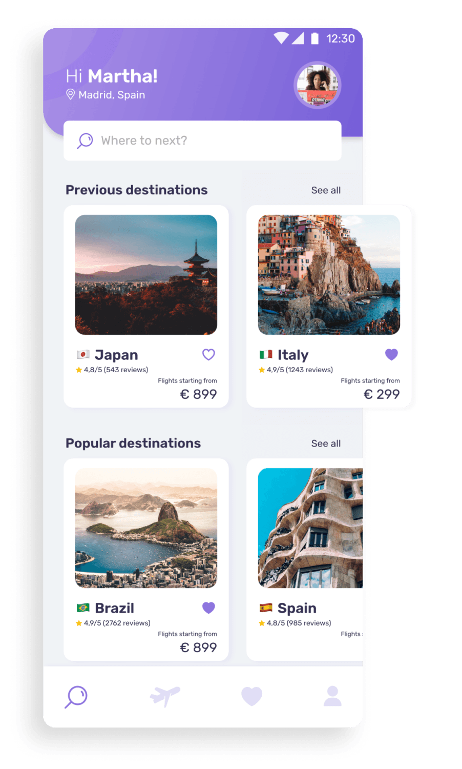
The user’s feedback was essential to improve my designs while working in the high fidelity visuals. Based on their feedback, the wireframes turned into a very friendly interface, with a streamlined flow and pleasant visual design.
HOME
first things first
Search the destination you are looking for or select a sugestion from the categories.
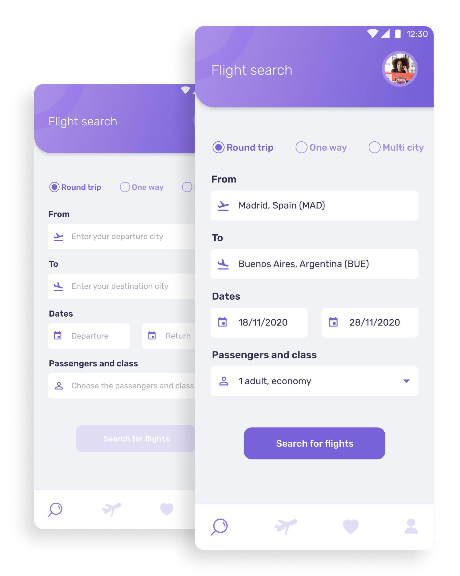
FLIGHT SEARCH
good start
Easy select: Round Trip, One Way or Multi City travel.
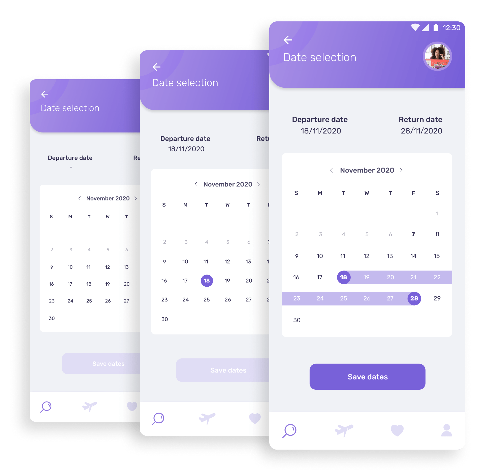
DATE SELECTION
just tell me when
Select the departure and return dates and have a clear view of time span.
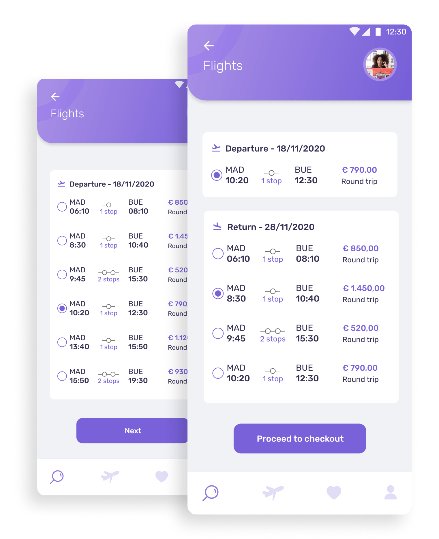
FLIGHT LIST
so many options
Choose the best flight according to your needs.
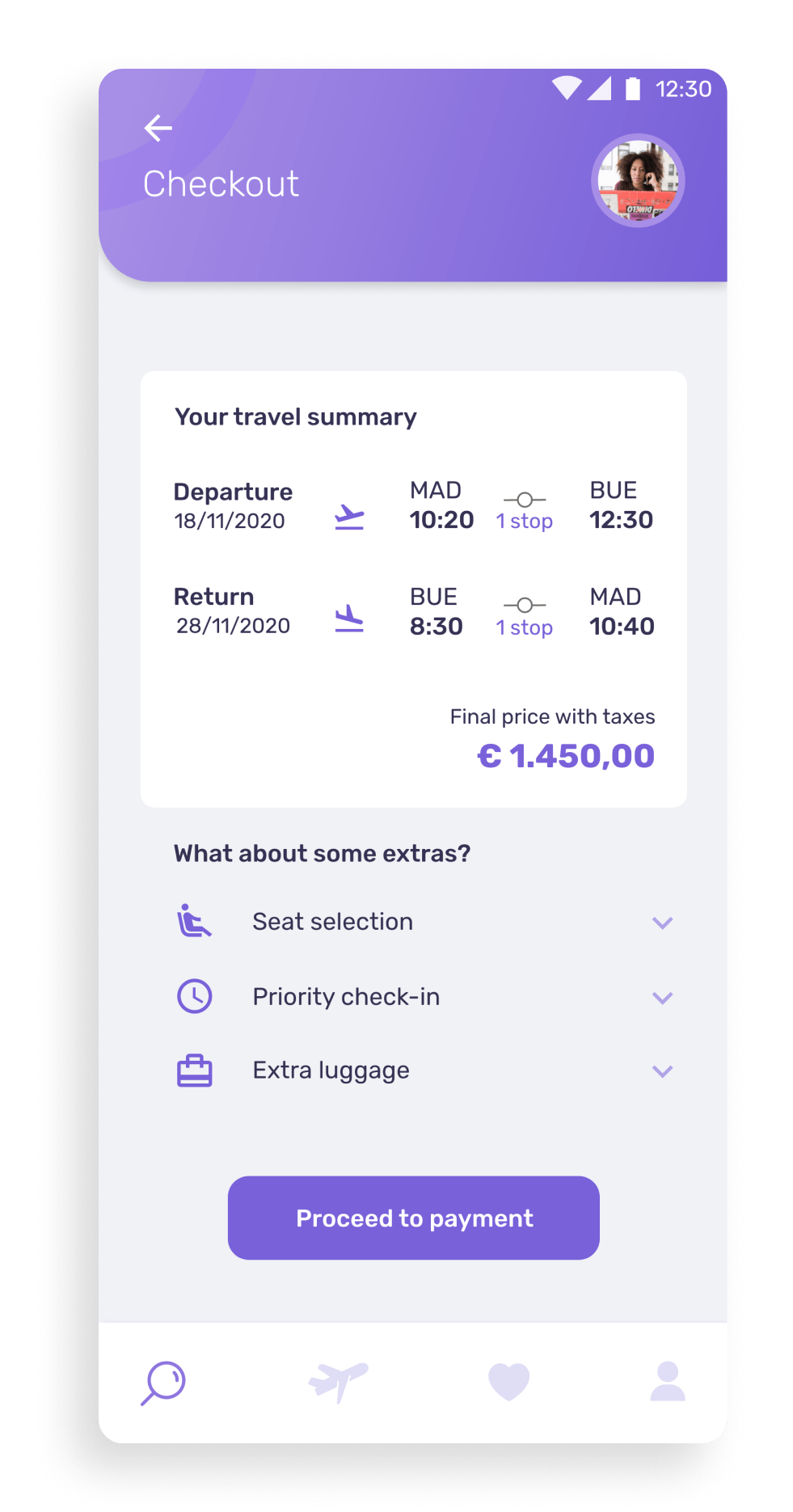
CHECKOUT
need some extras?
Do you want to select a seat? Need to buy extra luggage? Now it's time to do it.
Review your flight details and proceed to payment.
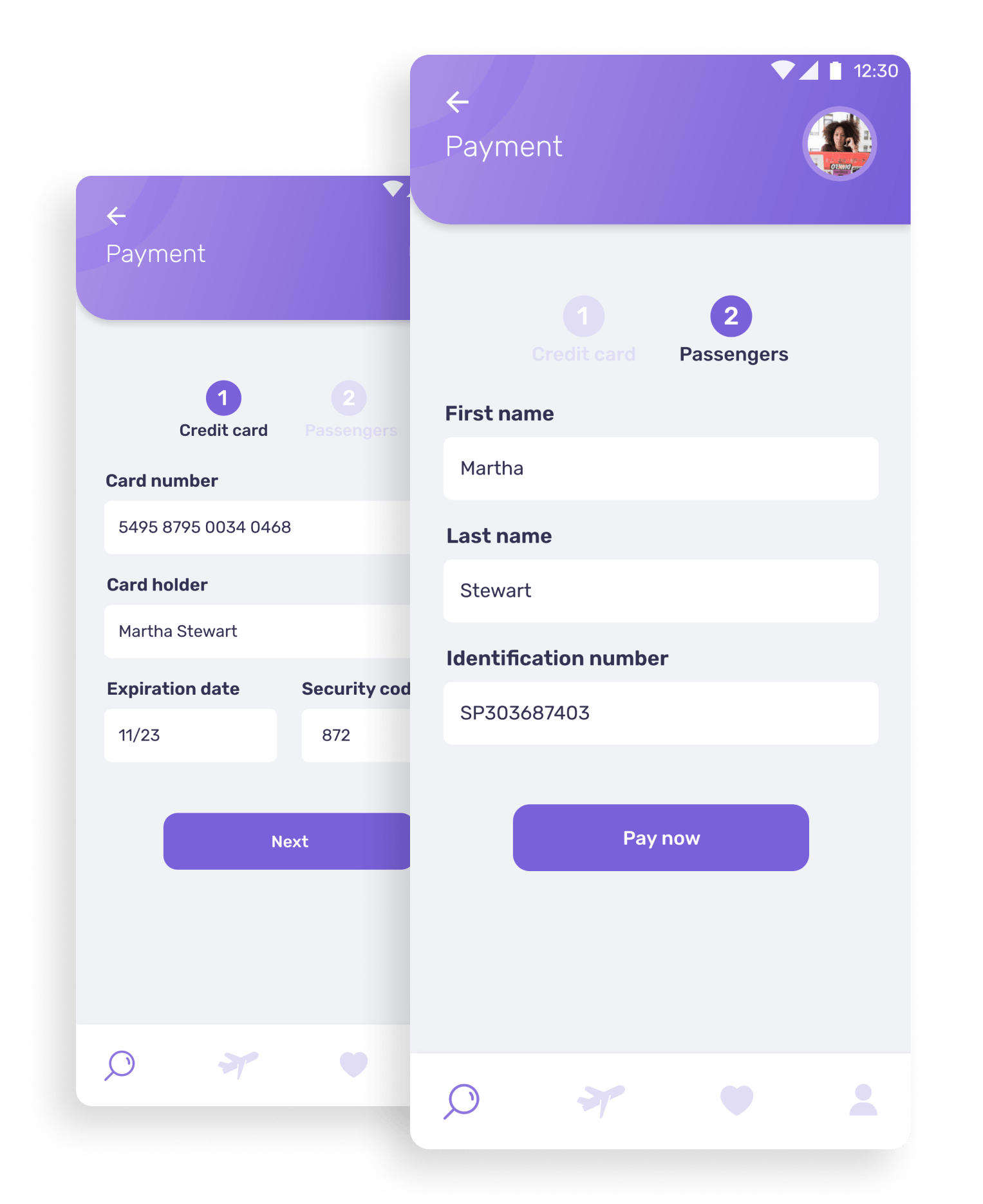
PAYMENT
easy, huh?
Make your payment fast and easily like 1, 2...
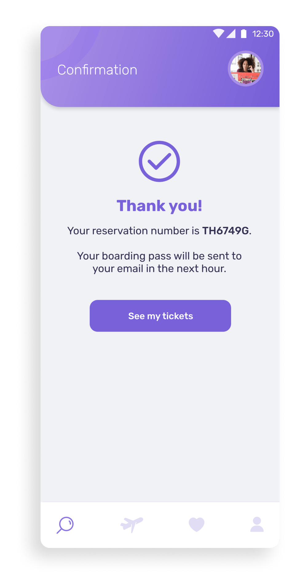
CONFIRMATION
all my bags are packed...
'Cause I'm leaving on a jet plane ;)
learnings & insights
I was very satisfied with the results of this project, especially because I got to test it in two different moments and improve the designs based on the collected feedback.
Considering the minimum acceptable score for SUS is 68 and that the lowest score obtained was 70, I understand that for this specific flow and users, this product would work.